
ILLUMINATE WHAT MATTERS
Renewing one of Norway’s oldest and largest insurance companies with a bold and editorial approach.
BACKGROUND
Gjensidige is one of Norway’s largest insurance companies and has over the last 20 years expanded to Sweden, Denmark and the Baltic states. Their visual identity needed a refresh to fulfil individual challenges across different countries and to adapt to the digital requirements across the platforms we interact with in our daily life.
SOLUTION
Risk of being injured, damaging our possessions, losing something or someone has been part of life as far as we can remember. But being prepared for the risk has gotten easier with the help of insurance companies. Gjensidige wants to share the knowledge and experiences gathered over 100 years with the public and help them to be prepared in the best way possible.
Based on Gjensidige’s iconic logo, we created the concept “Illuminate”. In the same way the lantern was used to illuminate dark streets and create security; the concept is now used to create an engaging and helpful brand and user experience.
This led us to an editorial visual approach. An identity system that allows dynamic layouts to be created with straight to the point bold headlines, informative texts, warm imagery and functional illustrations – all to be more relevant in people’s everyday lives.


Insurance is perceived as complex by many. Therefore, the aim of the new design was to clarify Gjensidige's visual expression. So that the brand is better heard - and better understood.

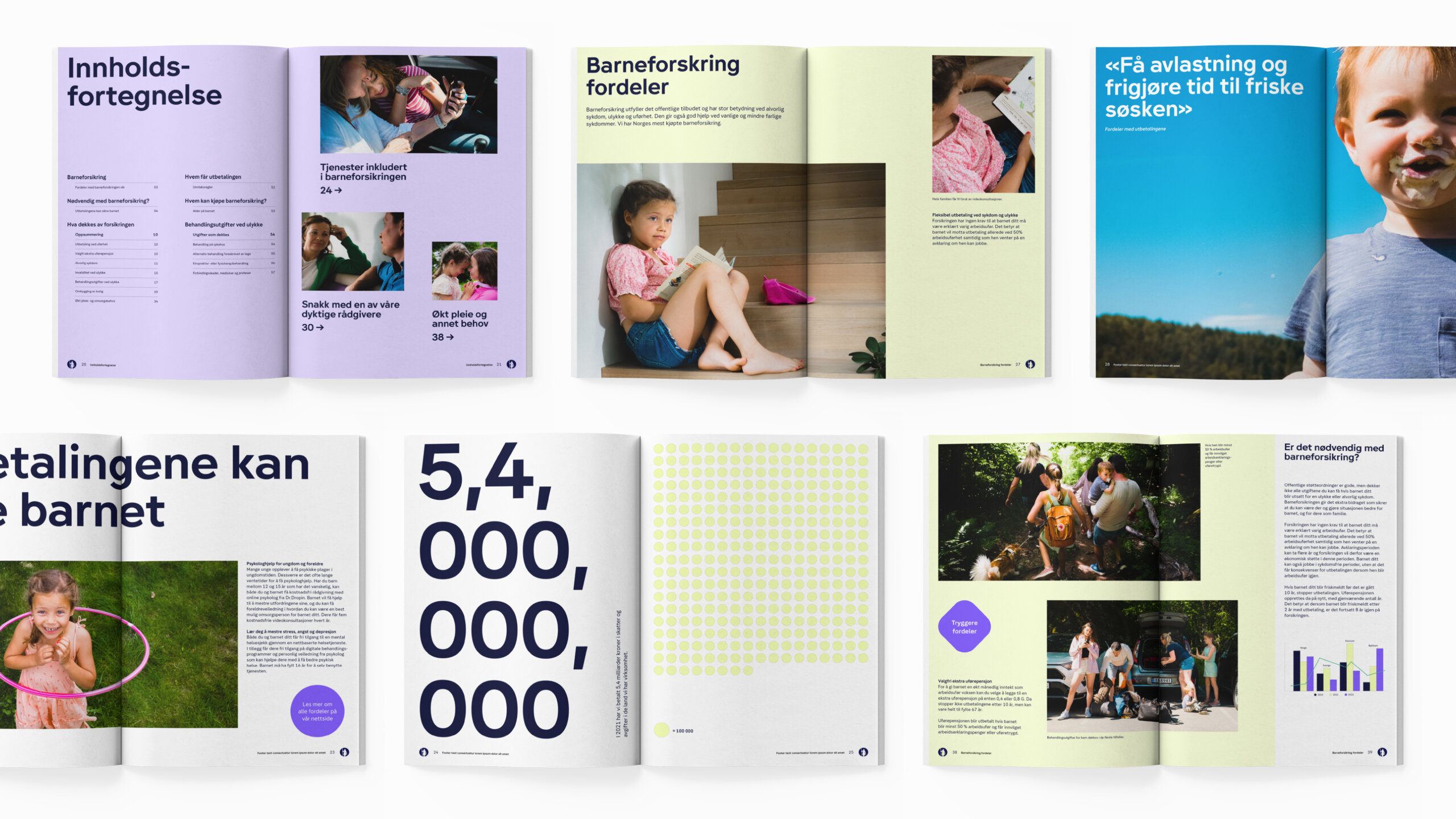

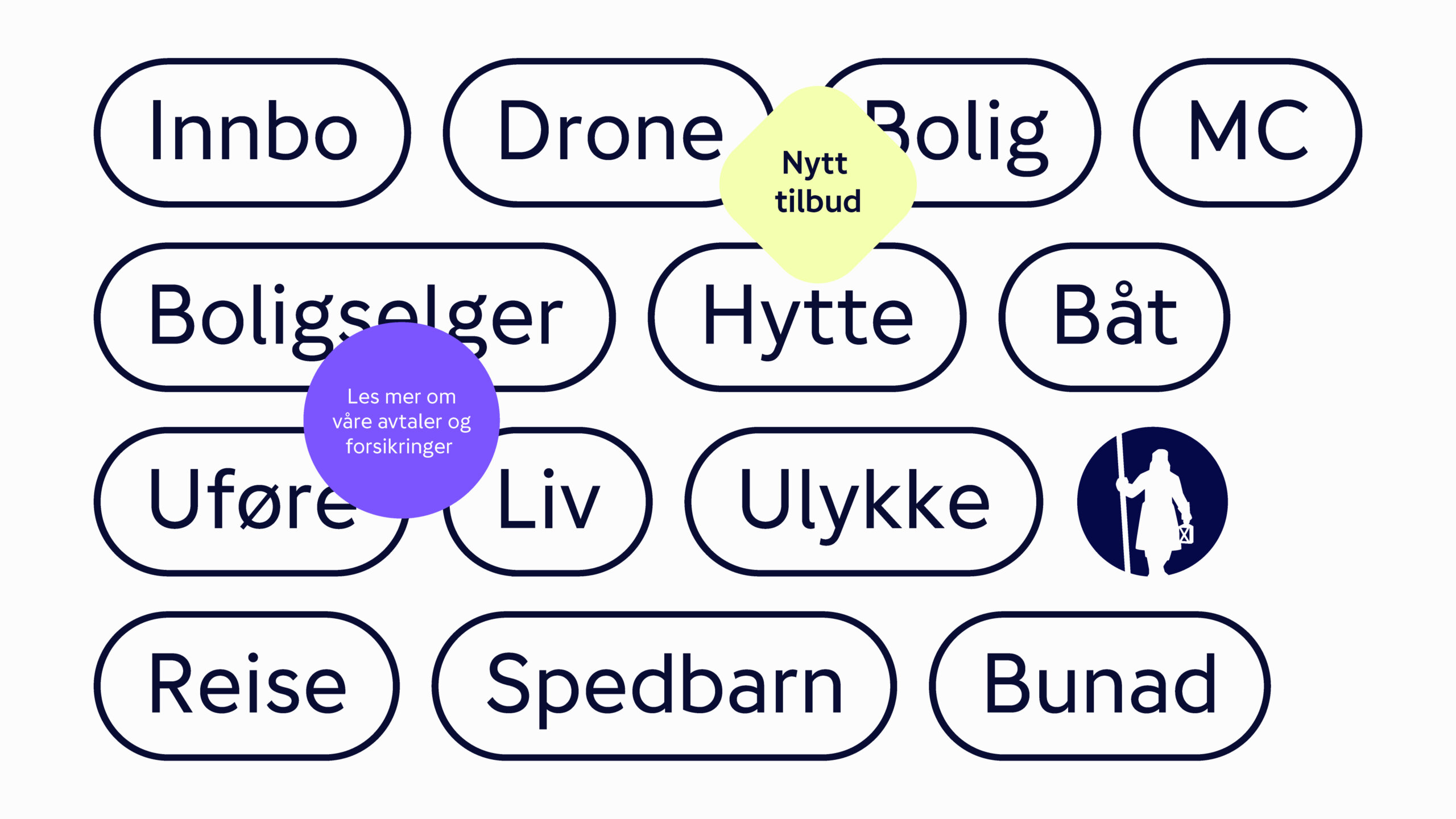


Photo: ByAksel
Illustrations: Robin Snasen / By Hands
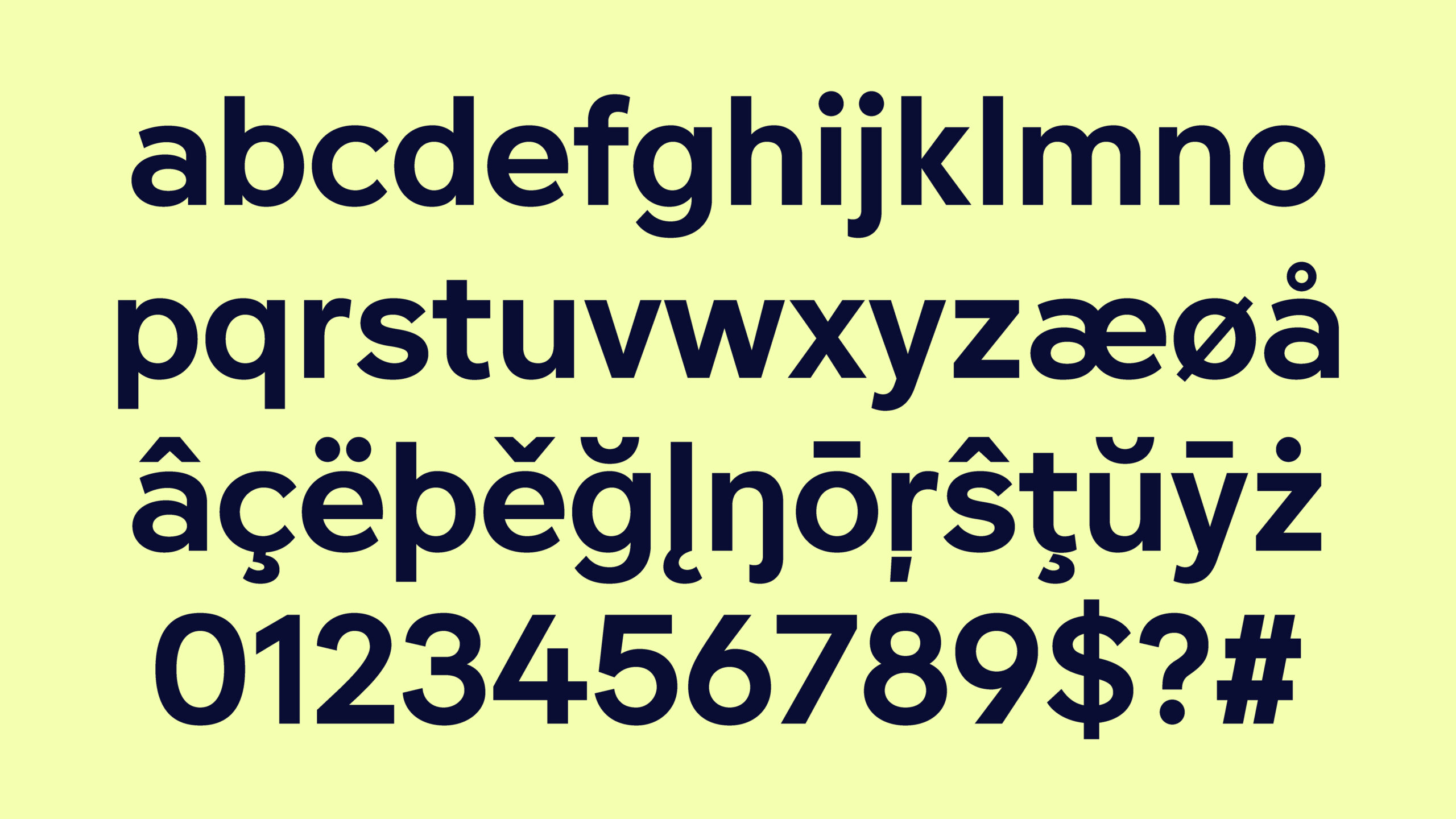
Typeface: Magnus Rakeng
Motion Design: Babusjka