Good energy, made simple.
Revitalizing one of the largest energy providers in Norway.
BACKGROUND
LOS is Norway’s fourth largest energy provider with ambitious plans to grow in the years to come. In an industry and a market characterized by rapid change, fierce competition, new business models and customers expecting increasinlgy more, we wanted to transform LOS into a stronger, clearer and more digital brand that could stand out in the market. Deliverables has been business design, brand platform and payoff, alongside a total revamp of their visual identity.
SOLUTION
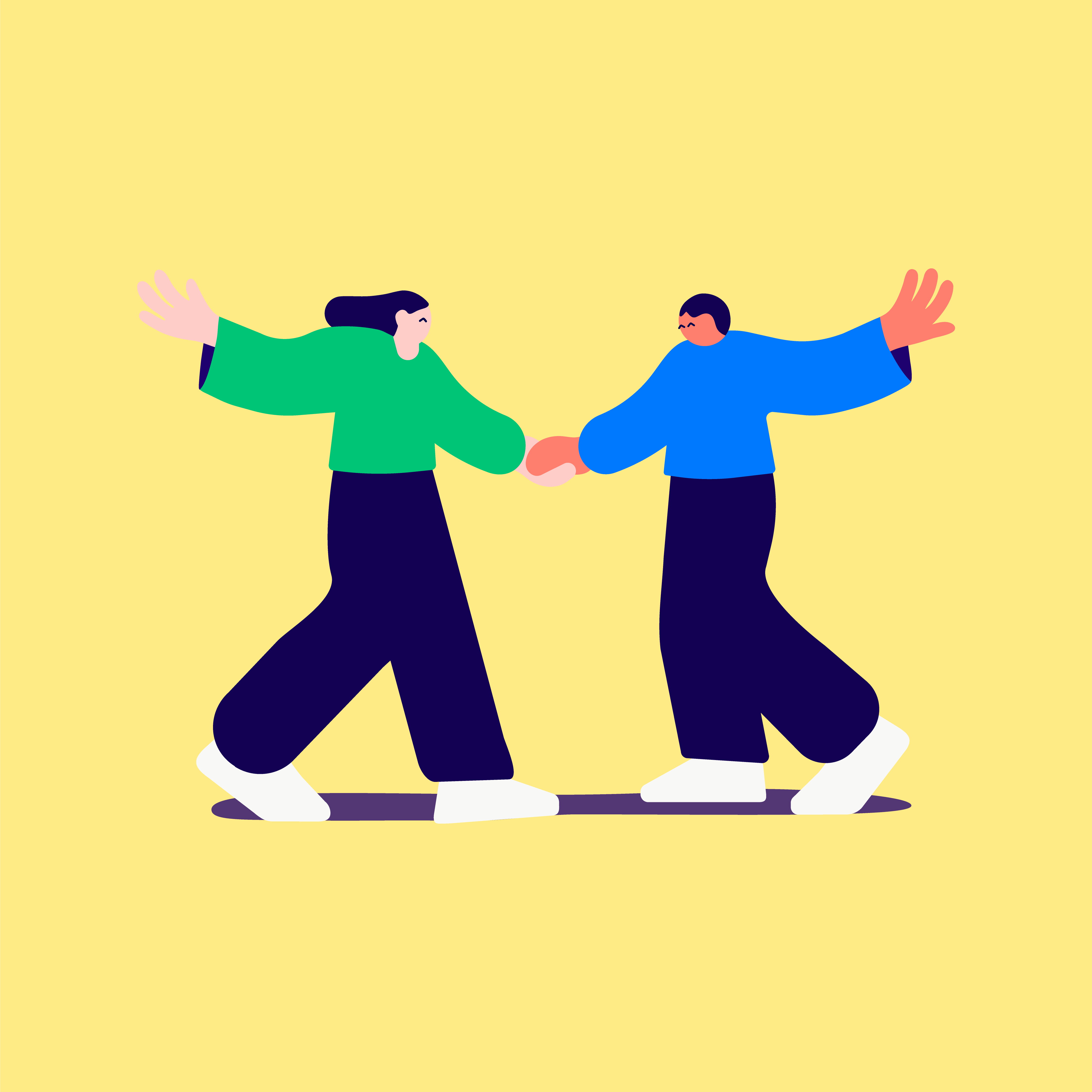
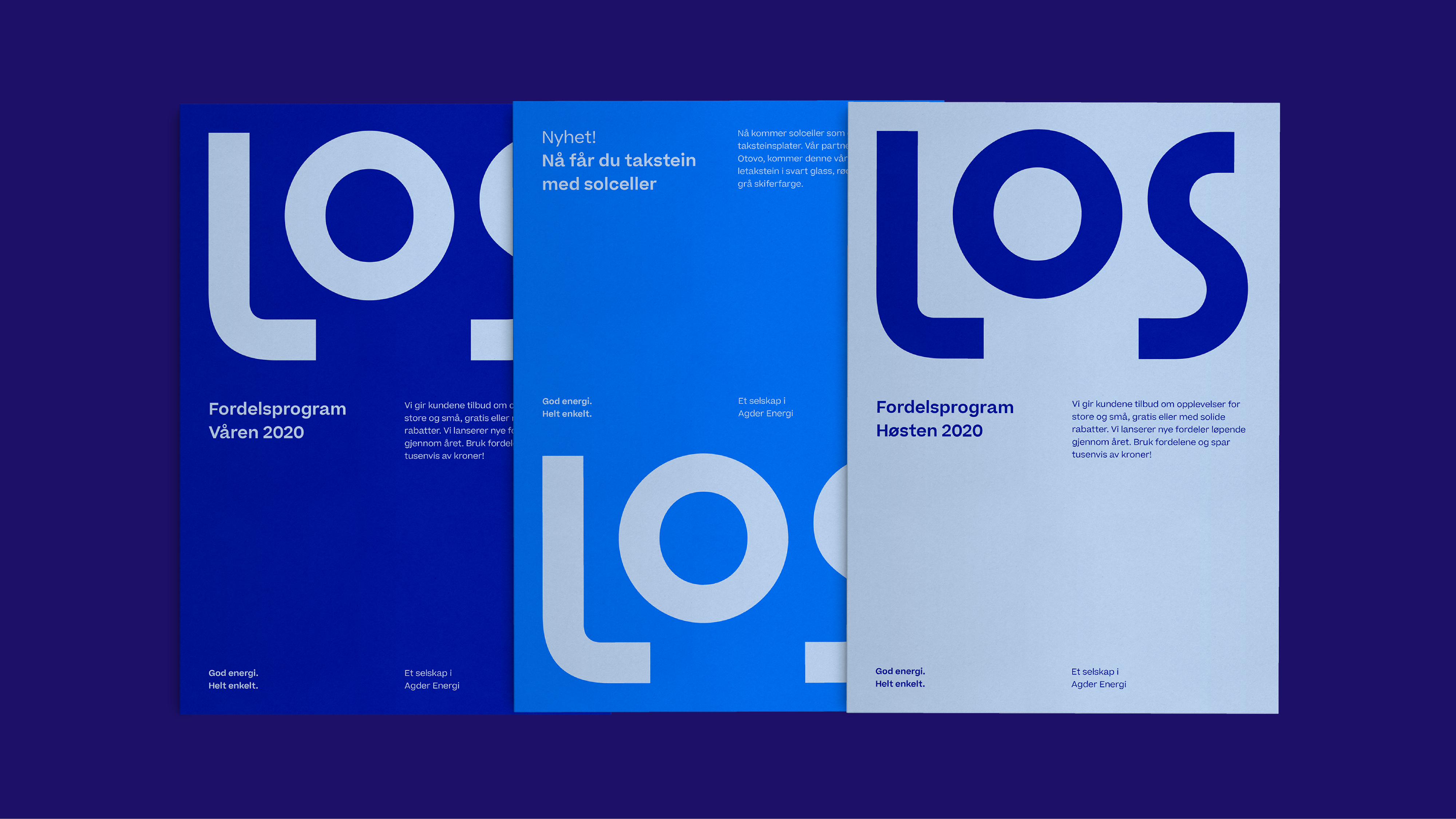
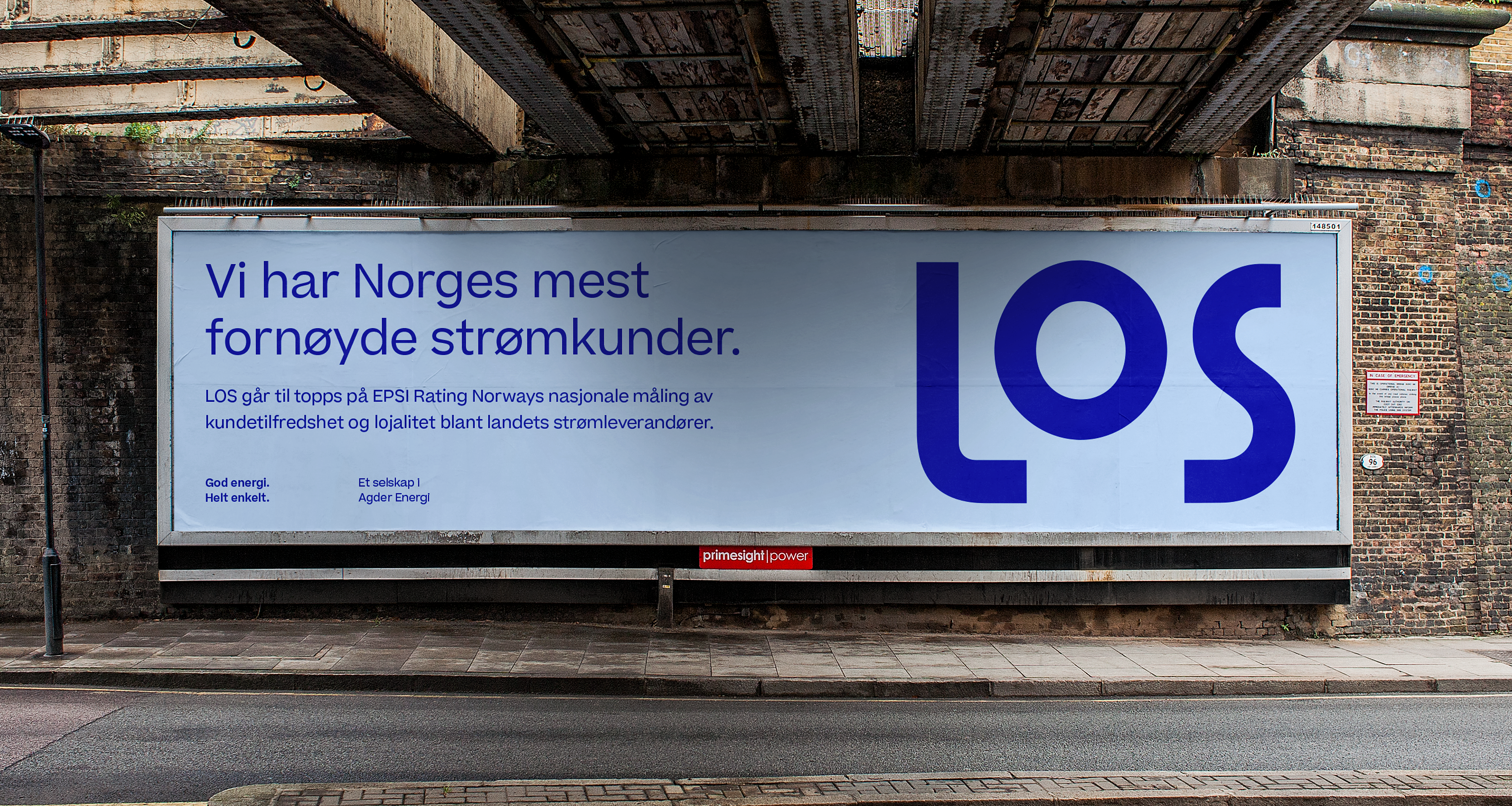
The revamped identity is based on the concept of «Good energy, made simple» which is made evident in the design through combining three pillars: Simplicity, clarity and energy. Simplicity as on overall principle, clarity in the distinct color scheme & layout and energy when combining all elements together with unique illustrations and a typeface with lots of personality.
We stripped away the box surrounding the former logo and tweaked the logo to make it more bolder and confident. We then took away all the unnecessary decor that was a big thing for the former visual identity and replaced it with a distinct color scheme in combination with a typeface full of character. Finally, we put it all together with illustrator Oscar Grønner to create an energized layout with differentiating tools for all things digital. The sum of it all is a visual identity ready for standing out in omni-channeled marketing reality.


