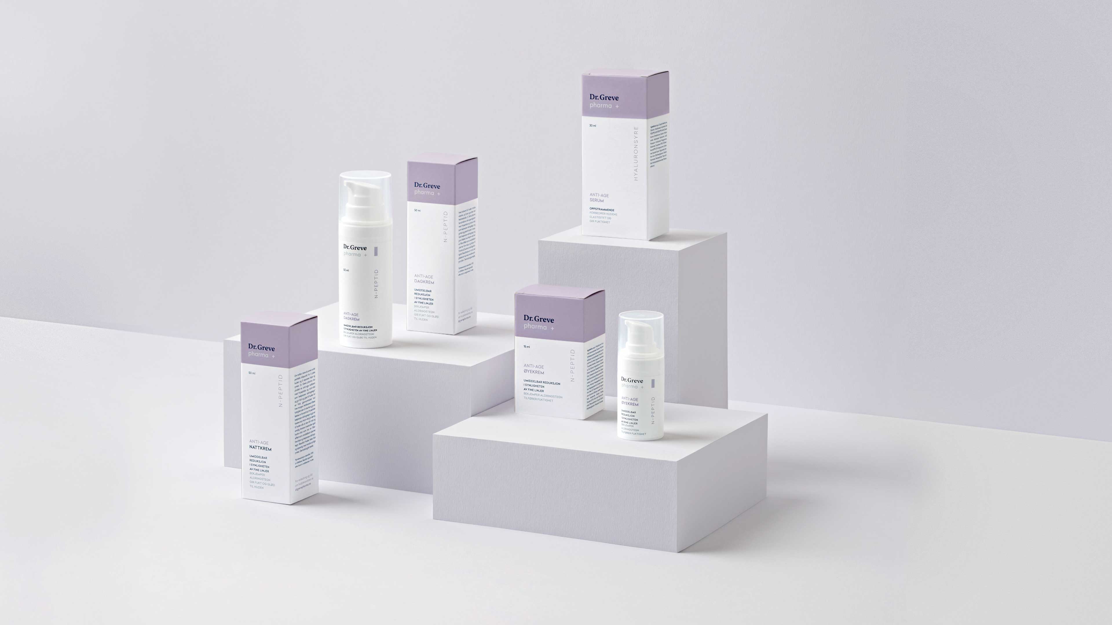
A CLEAN LINE
Dr. Greve pharma is a new addition to the well-known brand specifically designed for the pharmaceutical markets.
BACKGROUND
Dr Greve is a well known gentle skincare brand sold at Norwegian supermarkets. They saw an opportunity to expand the brand further with a new skincare product range sold exclusively at Norwegian pharmacies. The new brand spans five series designed for different skin types specifically catered to Norwegian consumers. In addition to the five face cream series, the range also includes an additional range of shampoo, body wash and moisturizers for babies and kids.
SOLUTION
The new brand had to be based on the success of the classic Dr Greve range sold at the supermarket, while still being recognized as a new more high-end addition. By implementing a light, modern color palette to color-code the brand, the brand is easily recognized at the pharmacy, while retaining a unique identity across the various series. Utilizing white space, contrasting typography and a colored strict square shape along the top, the brand stand out among other skincare products sold at the pharmacy.


Design by Neue + Nora Bremnæs
Pictures by Anne Valeur
Animation by Jørgen Håland
