Safety and fun
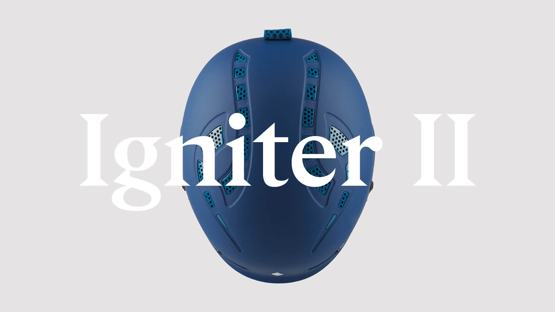
Blending industry-leading innovation with the finest artistry available to create the safest and most advanced protective gear and apparel.
BACKGROUND
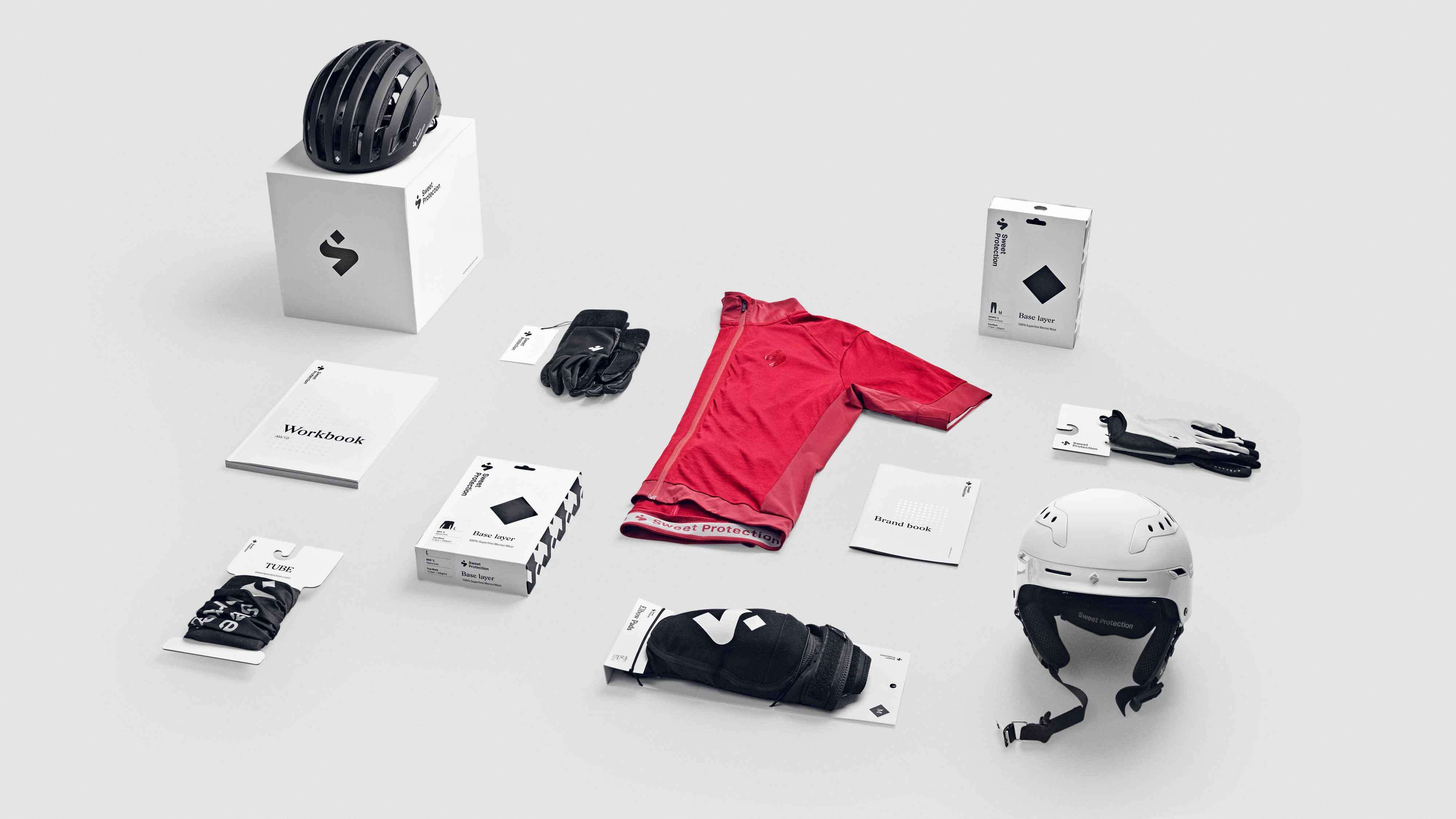
When Sweet Protection started in the year 2000, the goal was to “create superior protection inspiring people to push their boundaries”. This is the driving force of everything Sweet represents. Sweet wanted this to be crucial in their visual communication, logo, packaging design and the overall visual identity.
SOLUTION
Sweet is about security and rough attitude. Based on this insight, we created a visual universe consisting of few but clear design elements. Through simple yet distinctive idiom, Sweet Protection should appear as a “no-bullshit” brand with innovative expertise on the most important aspects; protection and fun.

Superior protection inspiring people to push their boundaries.
